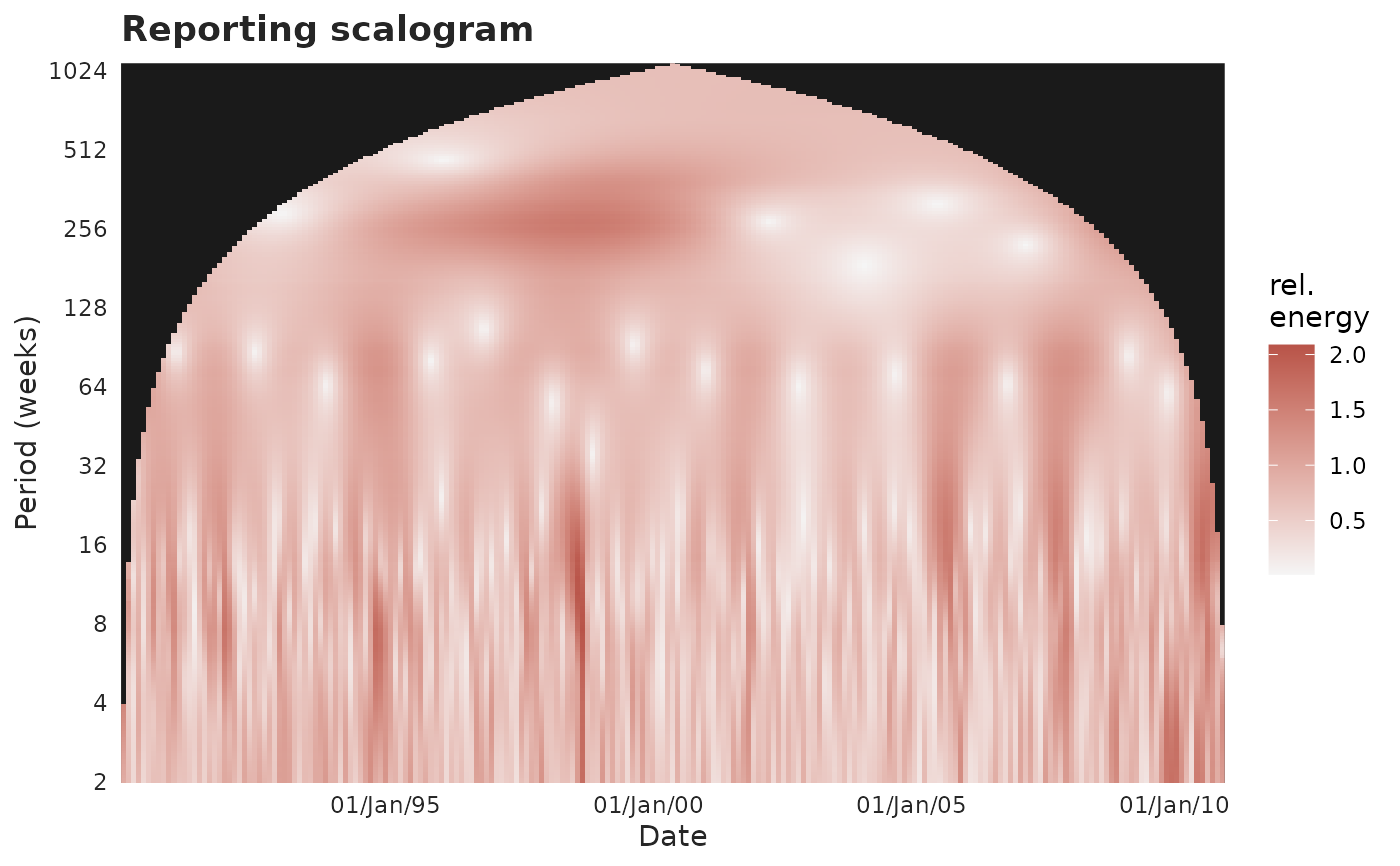
Plot the reporting or epidemic scalogram
plot_scalogram.Rd![[Experimental]](figures/lifecycle-experimental.svg)
A wavelet scalogram splits a count series, at every moment, into fast wiggles (short periods, at the bottom) and slow swings (long periods, at the top), and shows the energy at each as a heat map. A batch – a sudden one-step burst of reports – lights up as a bright short-period ridge in the reporting scalogram that the epidemic (event) scalogram lacks, since real cases arrive smoothly. Periods are measured in the object's own time step (days, weeks, ...), so the series is analysed on its integer grid, not forced to days.
Arguments
- x
A
tbl_now()object.- type
"reporting"(default; reports by report date) or"epidemic"(cases by event date).- windowrad
Radius of the time window (in report-grid steps).
NULLlets wavScalogram choose.- wname
Mother wavelet passed to wavScalogram (e.g.
"PAUL","MORLET")."PAUL"localises a batch more sharply in time.- format
Date format for the x-axis tick labels (see
strftime()). Default"%d/%b/%y".- plotly
If
TRUE, return an interactive plotly widget instead of a static plot. DefaultFALSE.- axis
Which time axis to draw:
"report"(default) or"validation". On the validation axis the picture answers the laboratory's version of the question – when results arrived, rather than when reports did. Needs a validation process (seeadd_validation_date()); cases still"pending"have no validation date and are left out.- palette
A named colour palette. Defaults to the package palette.
Details
This uses a window-inner scalogram (wavScalogram, border_effects = "INNER"): it is computed from the observed data only, with no border
padding. That matters for surveillance / nowcasting, where the usual periodic
or zero padding would fabricate structure exactly at the most recent ("now")
edge we care about. The price is that the estimate near the time edges uses a
smaller window (the blank region), so there is no need to hedge what is shown.
See also
plot_reporting_process() and
plot_epidemic_process() for the two series this decomposes;
plot_cycles() for the same idea pooled over time (a periodogram) rather than
resolved moment by moment; diagnose_batches() to test a short-period ridge;
diagnostic_plot() for the whole gallery.