![[Stable]](figures/lifecycle-stable.svg)
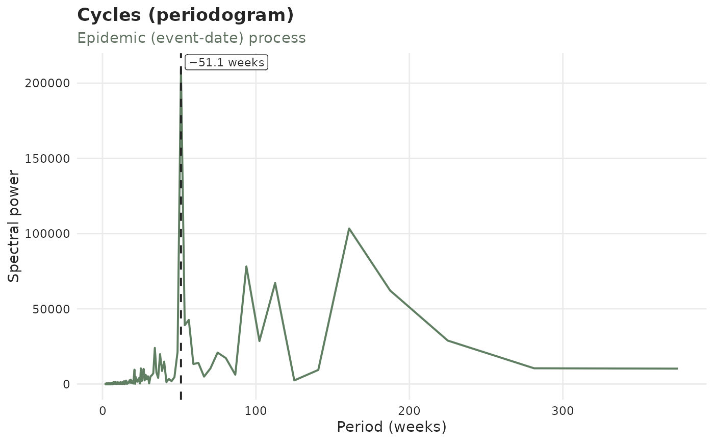
The "seasonality" / "delay_seasonality" panels of autoplot(), drawn on
their own: a periodogram whose dominant peak is marked. For
type = "epidemic" (green) the peak suggests a Fourier season length to pass
to temporal_effects(); for type = "report" (red) it marks a cycle in the
reporting delay itself, such as a weekly reporting rhythm.
Usage
plot_cycles(x, type = c("epidemic", "report", "revision"), ...)Arguments
- x
A
tbl_now()object.- type
"epidemic"(default),"report"or"revision".- ...
Further arguments passed to
autoplot.tbl_now(), e.g.by_strata,strata,plotlyorpalette.