![[Experimental]](figures/lifecycle-experimental.svg)
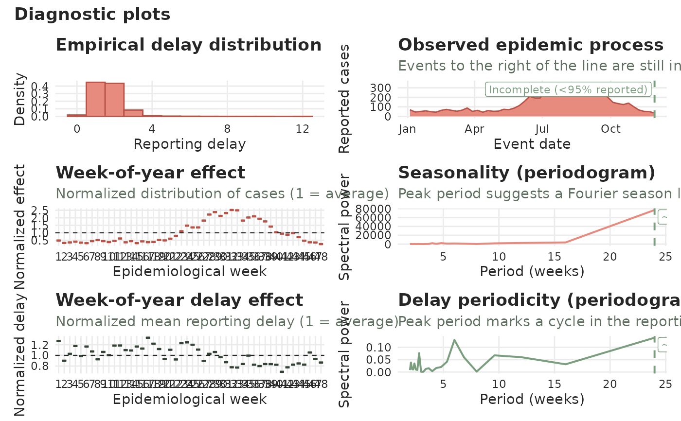
Produces a multi-panel diagnostic overview of a tbl_now using
ggplot2::ggplot() and patchwork. The gallery is a matrix with one
column per process: the case counts on the left, the reporting
delay next to them, and — when the object declares a revision axis — the
revision process on the right. Each row asks the same question of every
process, so an object with two dates comes out two columns wide and one with
three dates three columns wide. You choose which panels to draw with the
panels argument, and the number of columns follows: a selection covering
one family only (panels = "calendar") is one column.
A row a process cannot answer — weekly data has no day-of-week panel — leaves that cell empty rather than closing the gap, so the columns keep their meaning all the way down.
Case-count panels
"delay_distribution"— a (case-count weighted) histogram of the reporting delay (.delay). Forcount-cumulativedata this panel instead shows the cumulative growth by delay: boxplots (on a log scale, with a dashed reference at1) of the ratio of each event date's cumulative count at a delay to its cumulative count at the previous delay. A ratio above1is an upward revision, below1a downward one, and the boxes converge to1as reporting completes."epidemic"— the latest reported case counts perevent_date, with a dashed vertical line marking where the data become incomplete (less thanlevelof the delay distribution has arrived). Holidays from the attachedtemporal_effects()spec are marked with dots."calendar_weekday","calendar_week","calendar_month"— boxplots of the normalized case effect (each event date's cases divided by the overall mean, so 1 is average) by day of week, epidemiological week, or month."calendar_holiday"— the same normalized boxplots by day type, titled "Weekend and/or holiday effects" because that is what the day types are. The categories follow the attachedtemporal_effects()spec: a holiday calendar and aweekendeffect together giveWeekday/Weekend/Holiday, a calendar alone givesNon-holiday/Holiday, and aweekendeffect alone givesWeekday/Weekend. A holiday falling on a weekend counts as a holiday."calendar_holiday_lag"— the same normalized boxplots by position relative to the nearest holiday, as asked for byholiday_lags(seetemporal_effects()):"2 before","1 before","Holiday","1 after", ..., plus"Other"for every other day as the reference. It shows exactly the days the..._holiday_lag_k/..._holiday_lead_kcolumns flag — weekends and other holidays are skipped when counting working days — so you can see whether the lags you asked for are the ones that matter."seasonality"— a cycles periodogram of the incidence series whose dominant peak suggests a Fourier season length fortemporal_effects().
Reporting-delay panels (to inspect delay effects)
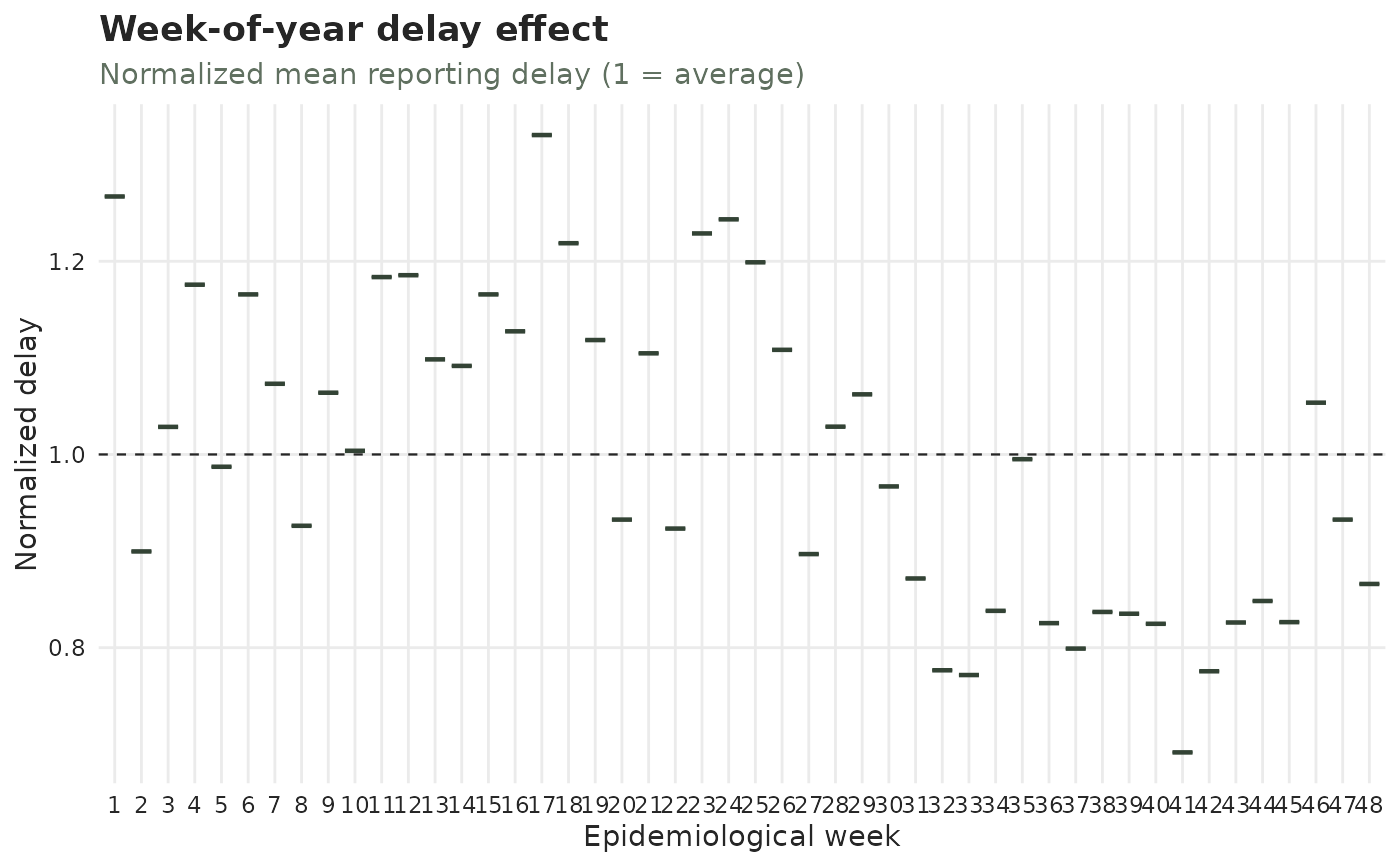
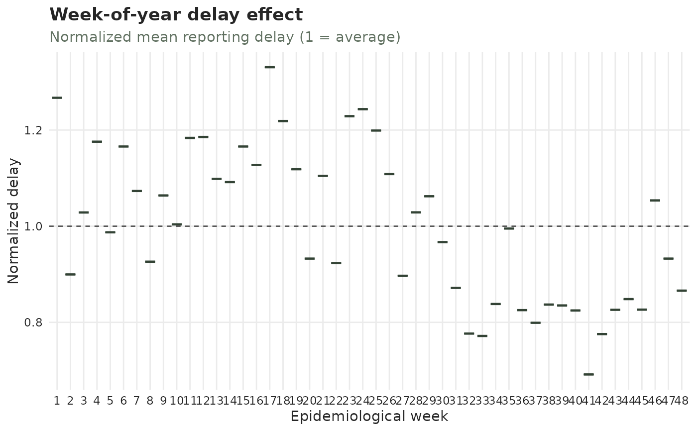
"delay_weekday","delay_week","delay_month"— boxplots of the normalized mean reporting delay (each event date's mean delay divided by the overall mean delay, so 1 is average) by day of week, epidemiological week, or month; these reveal whether the delay itself has a calendar pattern. Normalizing keeps them on the same scale as the case-count calendar panels and makes them comparable across strata."delay_holiday","delay_holiday_lag"— the reporting-delay twins of the two holiday panels above: the normalized mean delay by day type and by position relative to the nearest holiday. These are often the more telling pair — a holiday usually does not change how many cases occur, but it very much changes how long they take to be reported."delay_seasonality"— a cycles periodogram of the mean-delay series, whose peak marks a cycle in the reporting delay (e.g. a weekly reporting rhythm).
Revision-process panels (only when the object declares a revision axis)
"revision_distribution"— the reporting-delay histogram's twin on the revision axis: a (case-count weighted) histogram of.revision_delay, the time from a report to its resolution. A case still"pending"has no resolution and so no revision delay, and does not appear."revision_weekday","revision_week","revision_month","revision_holiday","revision_holiday_lag","revision_seasonality"— the same calendar and periodogram questions asked of the dates resolutions arrived on.
Every panel is colour-coded by the process it describes — red for the reporting-delay panels, green for the case-count (epidemic) ones — and says which one it is in its subtitle, so a single panel still reads on its own.
Which panels are available depends on the object. The calendar/delay
panels follow the event unit: daily data offers day-of-week and
week-of-year panels, weekly data week-of-year, monthly data month-of-year. The
four holiday panels describe the attached temporal_effects() spec, so
they appear only when there is one to describe: "calendar_holiday" /
"delay_holiday" need a holidays calendar or a weekend effect, and the
two lag panels additionally need a non-zero holiday_lags. Requesting a
holiday panel without the matching effect warns and skips it. The spec is read
directly, so you do not need to call compute_temporal_effects() first.
The delay panels are computed on the complete portion of the series (event dates on or before the incompleteness line) so the recent reporting truncation does not bias them.
Usage
# S3 method for class 'tbl_now'
autoplot(
  object,
  ...,
  panels = "all",
  by_strata = FALSE,
  strata = NULL,
  measure = c("percent", "normalized"),
  by_revision_type = FALSE,
  level = 0.95,
  plotly = FALSE,
  size = 1,
  linewidth = 1,
  palette = .tbl_now_palette(),
  delay_distribution_xlim = NULL,
  event_date_xlim = NULL,
  calendar_effect_xlim = NULL,
  seasonality_xlim = NULL
)
Arguments
- object
A
tbl_nowobject.- ...
Unused; present for compatibility with
ggplot2::autoplot().- panels
Which panels to draw. Either a vector of the concrete keys listed above, or one of the aliases
"all"(default; every applicable panel),"calendar"(the case-count calendar panels) or"delay_calendar"(the reporting-delay calendar panels). Selecting a single panel returns that panel as a plain ggplot2 object instead of a patchwork.- by_strata
Logical (default
FALSE). WhenTRUE, every panel is split by stratum: the calendar / delay boxplots become dodged boxes (one per stratum, side by side), the epidemic process and both periodograms become one coloured line per stratum (no area fill), and the delay distribution becomes dodged bars (one per stratum). The boxplots are then normalized per stratum (1 = that stratum's own average) so the calendar pattern is comparable across strata. Colours use a viridis scale. In this mode the holiday dots are omitted from the epidemic panel.- strata
Character vector of column names to group by when
by_strata = TRUE.NULL(default) uses the object'sstrata(seeget_strata()); pass a subset (e.g.strata = "gender") to group by only some of them. Ignored whenby_strata = FALSE.- measure
How to express the calendar-effect boxplots (the day-of-week, week-of-year and month-of-year panels; every other panel ignores it, and the two holiday pairs are always
"normalized"— see below)."normalized"— the value divided by its overall mean, so1(the dashed line) marks an average level. Case-count panels normalize the cases per event date; delay panels normalize the mean reporting delay."percent"(default) — the share of cases falling in each group, as a percentage, so the box reads directly as "10% of cases at the weekend versus 90% on weekdays" with the IQR around it. One observation per calendar block: the seven weekdays (and the day types) are shared out within each week, the holiday lags within each month, and the epidemiological weeks and months within each year. The reporting-delay panels then switch from the event date to the report date, so they answer "what share of the reports arrive on a weekend?". NeedsDateevent/report columns.
The four holiday panels (
"calendar_holiday","calendar_holiday_lag"and their delay twins) ignoremeasureand are always drawn"normalized". Their categories are not equal-sized parts of a calendar block — the weekend is two days in seven — so a share would mostly report how the calendar is built rather than how the data behave: "29% of cases at the weekend" is average, not low.- by_revision_type
Logical (default
FALSE). WhenTRUE, the two delay-distribution panels are split by how each case eventually resolved:confirmed,pending,retractedandunknown, stacked, in the palette's outcome colours (seetbl_now_palette()). Ignored on an object with no revision axis, and whenby_strata = TRUE, which already spends the fill on the strata. It defaults toFALSEhere because the gallery is read as a grid of shapes, and toTRUEinplot_delay_distribution(), where the panel is the whole plot.- level
Completeness level used for the incompleteness line in the
"epidemic"panel (and to trim the delay panels). The line is drawn atnow - q, whereqis thelevelquantile of the delay distribution. With the default0.95, the line marks where at least 5 percent of delays are yet to arrive.- plotly
If
TRUE, return an interactive plotly widget (the panels stacked) instead of a static patchwork. DefaultFALSE.- size
Multiplier on every point, outlier and annotation-label size the panels draw. Default
1. It multiplies rather than replaces, so a panel that deliberately draws one mark larger than another keeps that difference at any setting.- linewidth
Multiplier on every line, boxplot outline and reference-line width the panels draw. Default
1.- palette
A named colour palette (see
tbl_now_palette()). Every colour is named for the role it plays, so overriding one role re-themes every panel that uses it.- delay_distribution_xlim, event_date_xlim, calendar_effect_xlim, seasonality_xlim
Optional length-2 vectors giving the x-axis limits for the corresponding panel (delay-distribution histogram, epidemic process, calendar-effect boxplots, incidence periodogram).
NULL(default) lets each panel pick its own range. Forevent_date_xlimpassDates; the others take numeric limits.
Value
A patchwork object combining the selected panels, one column per process, or — when a single panel is selected — that panel as a ggplot2 object.
See also
diagnostic_plot() for the companion gallery, which looks at the reporting
process – when reports arrived and whether any of it is artificial – rather
than at the case counts;
the panels here as standalone functions: plot_observed_cases(),
plot_delay_distribution(), plot_cycles(), calendar_effect_plots and
plot_delay_drift();
summary() and diagnose() for the same information as
tables. The
Diagnosing a tbl_now article
reads the panels one at a time.
Examples
data(denguedat)
# A few recent months keep the example fast; the panels look the same on
# twenty years of data, they just take longer to draw.
recent <- denguedat[denguedat$onset_week >= as.Date("2010-11-01"), ]
dengue <- tbl_now(recent,
event_date = "onset_week",
report_date = "report_week", strata = "gender", verbose = FALSE
)
autoplot(dengue)
 # A single panel comes back as a plain ggplot, so it can be selected, split
# by stratum and then treated like any other plot. `panels` takes any of the
# names listed above; `by_strata = TRUE` works on the whole gallery too, but
# one panel keeps the example quick.
autoplot(dengue, panels = "delay_week", by_strata = TRUE)
# A single panel comes back as a plain ggplot, so it can be selected, split
# by stratum and then treated like any other plot. `panels` takes any of the
# names listed above; `by_strata = TRUE` works on the whole gallery too, but
# one panel keeps the example quick.
autoplot(dengue, panels = "delay_week", by_strata = TRUE)
 # Panel-specific arguments compose with it: zoom the delay panel to 0-10 weeks
autoplot(dengue, panels = "delay_distribution", delay_distribution_xlim = c(0, 10))
# Panel-specific arguments compose with it: zoom the delay panel to 0-10 weeks
autoplot(dengue, panels = "delay_distribution", delay_distribution_xlim = c(0, 10))