![[Stable]](figures/lifecycle-stable.svg)
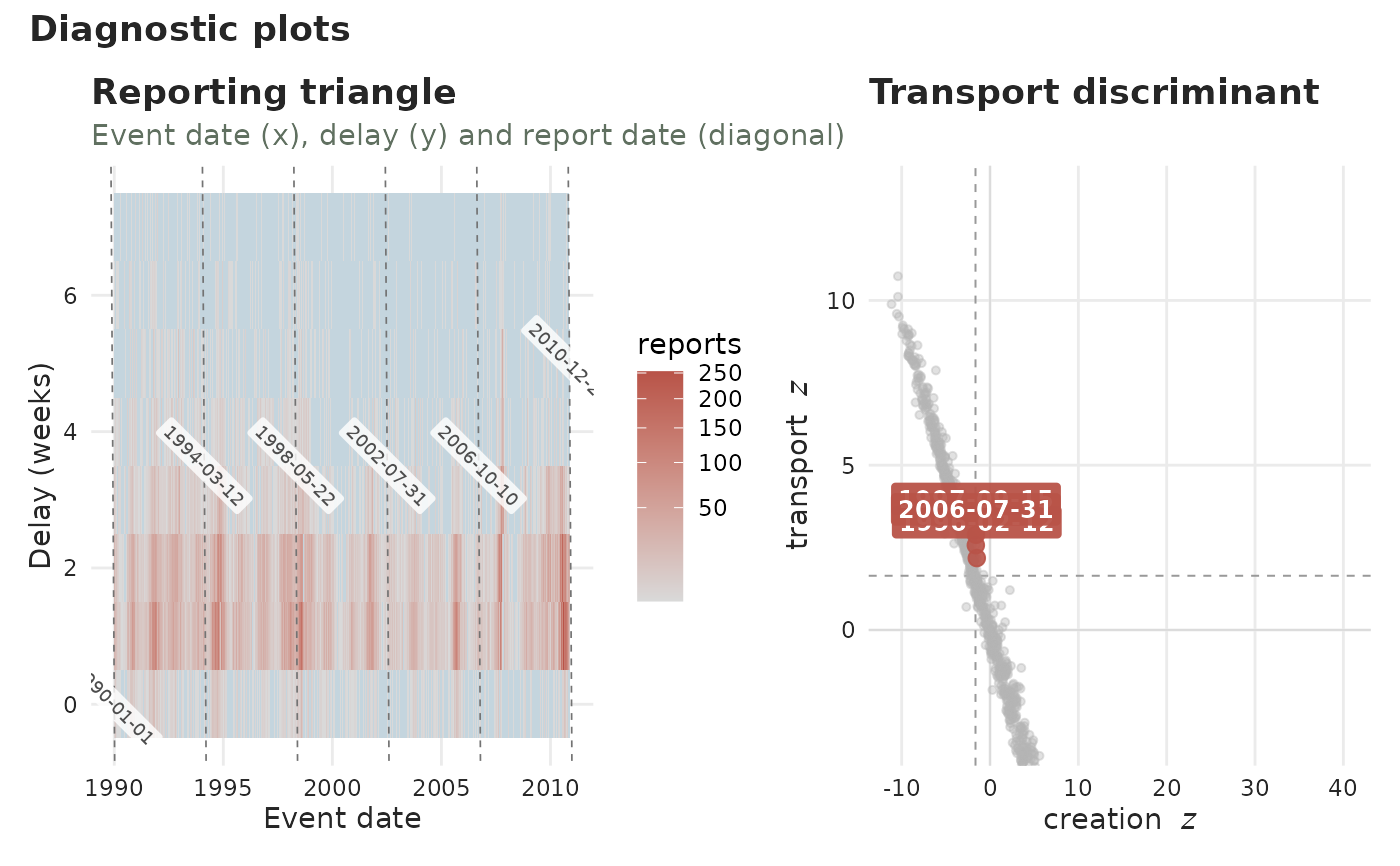
Lays out a gallery of complementary views of a tbl_now's reporting process,
all aimed at spotting reporting artefacts – especially batch reporting. Each
view is also available on its own (see See also); diagnostic_plot() picks
the ones named in panels and combines them with patchwork. Selecting a
single panel returns it as a plain plot. Every view is facetted by stratum when
the tbl_now declares strata.
Arguments
- x
A
tbl_now()object.- panels
Which panels,
"all"(default) or any subset of"reporting","triangle","profiles","delay_drift"and"transport".- by
For the
"profiles"panel, one mark per"report"date (default) or per"event"date.- max_delay
Largest delay on the delay-based panels.
NULL(default) caps at the delay covering 99% of reported mass.- ...
Batch controls (
lookback,period,alpha) routed to the"transport"panel.- plotly
If
TRUE, return an interactive plotly widget (the panels stacked) instead of a static patchwork. DefaultFALSE.- axis
Which time axis the delay is measured on:
"report"(default) or"revision". Report-axis delays are measured from event to report; revision-axis delays are measured from report to revision, the same quantity as.revision_delay. Needs a revision process (seeadd_revision_date()); cases still"pending"are left out.- size
Multiplier on point and label sizes, forwarded to every panel that draws them (
"triangle","transport"). Default1.- linewidth
Multiplier on data line widths, forwarded to every panel that draws them (
"profiles","delay_drift"). Default1.- grid_linewidth
Line width of the reference grids the package draws itself – not ggplot2's panel grid. Forwarded to
"triangle","transport"and"delay_drift". Default0.3.- palette
A named colour palette (see
tbl_now_palette()).
Value
A patchwork object, or a single plot when one panel is selected
(or a plotly widget when plotly = TRUE).
See also
Every panel is also a function of its own:
plot_reporting_process() and
plot_epidemic_process() (when reports arrived, versus when cases happened),
plot_reporting_triangle() (the full event-by-delay grid),
plot_delay_profiles() (each date's delay curve),
plot_delay_drift() (whether delays are getting longer),
plot_transport_discriminant().
Examples
data(denguedat)
# The two and a half years around the 1996 and 1997 backlog dumps: enough
# for the transport panel to have something to flag, quick enough to draw.
window <- denguedat[
  denguedat$onset_week >= as.Date("1995-06-01") &
    denguedat$onset_week <= as.Date("1998-01-01"),
]
dn <- tbl_now(window, onset_week, report_week, verbose = FALSE)
diagnostic_plot(dn, panels = c("triangle", "transport"))
#> Warning: ! `transport_discriminant()` is experimental: results are not guaranteed and
#>   the interface may change.
#> ℹ Treat a flagged report date as a potential batch, not a confirmed one.
#> This warning is displayed once every 8 hours.