![[Stable]](figures/lifecycle-stable.svg)
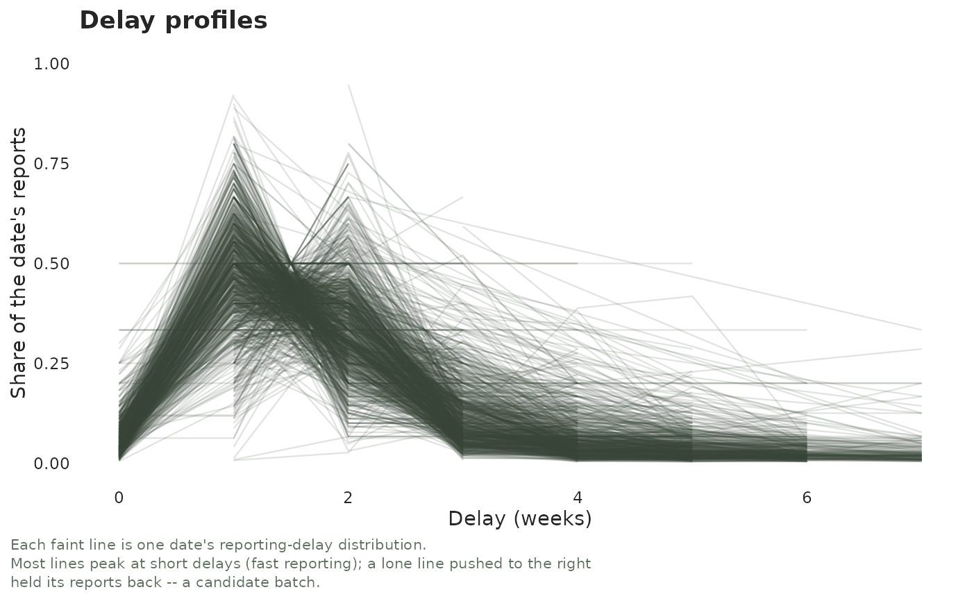
One translucent curve per date (see by) giving that date's share of reports
at each delay, coloured by its mean delay. A batch is a lone right-shifted
(long-delay) curve.
Arguments
- x
A
tbl_now()object.- by
One line per
"report"date (default) or per"event"date.- max_delay
Largest delay to draw.
NULL(default) caps at the delay covering 99% of reported mass.- plotly
If
TRUE, return an interactive plotly widget instead of a static plot. DefaultFALSE.- axis
Which time axis the delay is measured on:
"report"(default) or"revision". Report-axis delays are measured from event to report; revision-axis delays are measured from report to revision, the same quantity as.revision_delay. Needs a revision process (seeadd_revision_date()); cases still"pending"are left out.- linewidth
Multiplier on the width of the per-date curves. Default
1(drawn at0.4). The curves are deliberately faint and overplotted – it is their envelope that carries the message – so raising this on a long series fills the panel in.- palette
A named colour palette (see
tbl_now_palette()).
See also
plot_delay_distribution() for the pooled delay distribution rather than one
curve per date; plot_delay_drift() for whether those curves move over time;
diagnose_batches2() for the test behind the eyeball;
diagnostic_plot() for the whole gallery.