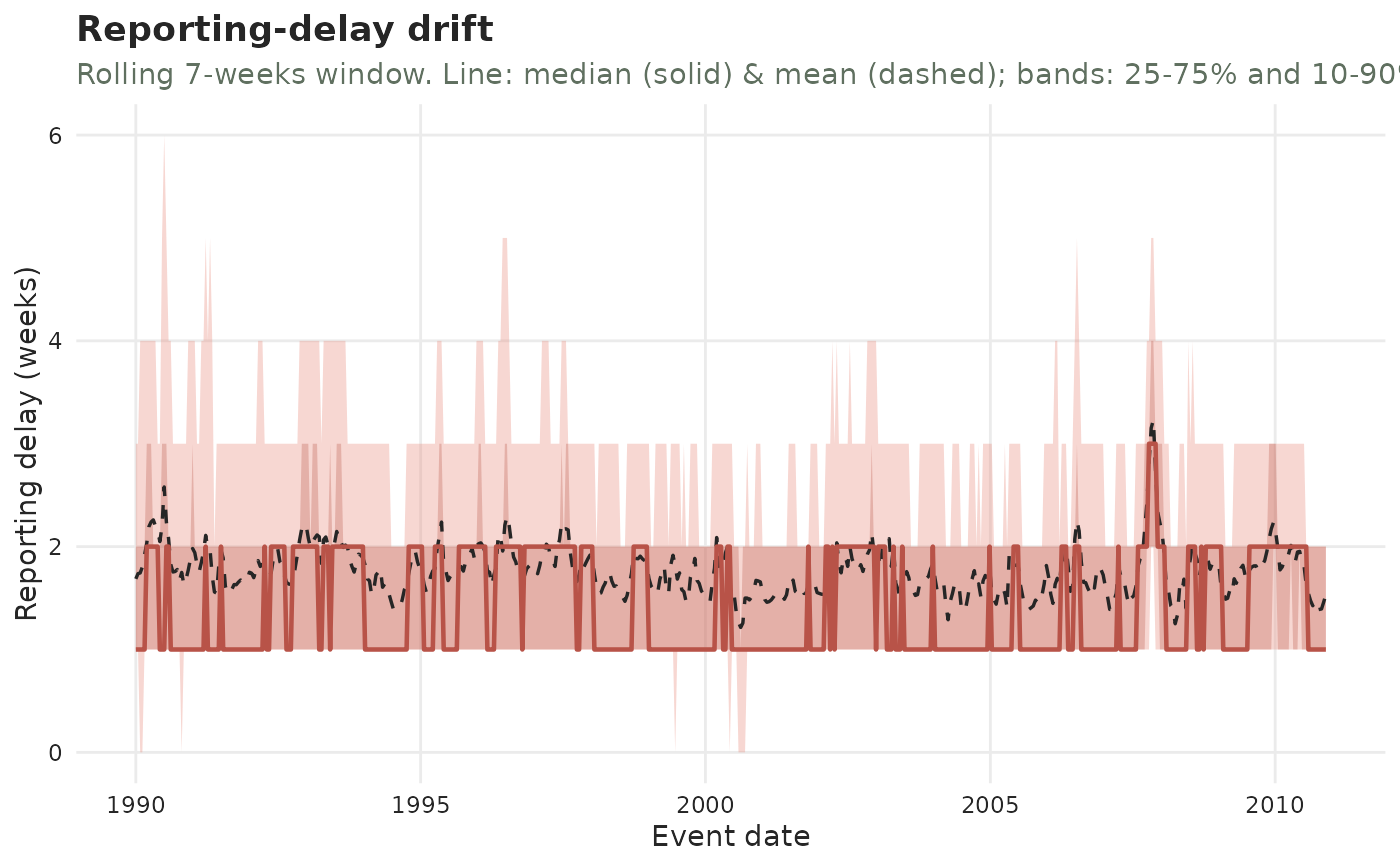
Visualise whether the reporting-delay distribution drifts over time
Source:R/delay_drift.R
plot_delay_drift.Rd![[Stable]](figures/lifecycle-stable.svg)
Draws a rolling fan chart of the count-weighted reporting-delay distribution indexed by event date: a solid line for the rolling median, a dashed line for the rolling mean, and two shaded bands (the 25-75% and 10-90% quantile ranges). Reading it left to right answers "do delays drift?" — a rising/falling centre line is location drift, widening/narrowing bands are spread drift.
Usage
plot_delay_drift(
  x,
  ...,
  window = NULL,
  step = NULL,
  min_n = 1,
  by_strata = FALSE,
  strata = NULL,
  changepoint = FALSE,
  level = 0.95,
  plotly = FALSE,
  axis = c("report", "revision"),
  linewidth = 1,
  grid_linewidth = 0.5,
  palette = .tbl_now_palette()
)
Arguments
- x
A
tbl_nowobject.- ...
Unused.
- window
Rolling-window width, in event-time periods.
NULL(default) uses7periods regardless of the time unit — that is, 7 days for daily data and 7 weeks for weekly data.- step
Step between window centres, in periods.
NULL(default) usesmax(1, window / 4).- min_n
Minimum total case count for a window to be drawn (default
1).- by_strata
Logical (default
FALSE). WhenTRUE, one fan is drawn per stratum (faceted).- strata
Character vector of columns to group on when
by_strata = TRUE.NULL(default) uses the object'sstrata.- changepoint
Logical (default
FALSE). WhenTRUE, mark the estimated abrupt change point of the median delay (Pettitt's test, on mature data) with a vertical line, when one is detected (p < 0.05). Seediagnose_changepoint().- level
Completeness level for the immature-region shading (default
0.95; seeautoplot()).- plotly
If
TRUE, return an interactive plotly widget instead of a static plot. DefaultFALSE.- axis
Which time axis the delay is measured to:
"report"(default) or"revision". Report-axis delays are measured from event to report; revision-axis delays are measured from report to revision, the same quantity as.revision_delay. Needs a revision process (seeadd_revision_date()); cases still"pending"are left out.- linewidth
Multiplier on the width of the mean and median delay lines. Default
1(drawn at0.6and0.8, so the median stays the heavier of the two at any setting).- grid_linewidth
Line width of the dashed maturity line and of the
changepointmarker – the reference lines the package draws itself, not ggplot2's panel grid. Default0.5.- palette
A named colour palette (see
tbl_now_palette()).
Details
Because recent event dates have not had time to be fully reported, their delay
summaries are downward-biased (only short delays are observable yet). That
immature region — event dates after the level incompleteness cutoff — is
shaded grey and should not be read as drift. Pair the plot with
diagnose_drift() for a formal test.
See also
diagnose_drift() for the formal trend test behind this picture, and
diagnose_changepoint() for an abrupt shift rather than a gradual one;
plot_delay_distribution() for the delay pooled over the whole period;
autoplot() and diagnostic_plot() for the galleries this
belongs to.