![[Stable]](figures/lifecycle-stable.svg)
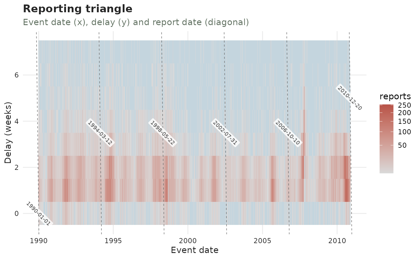
Tiles over (event date, delay), filled by the reported count. Cells that are
observable but empty (a genuine reported zero) are drawn in a muted blue;
cells that are not yet reportable (report date beyond now, the upper-right
wedge) are left blank. A third axis for report date is drawn as evenly
spaced dashed diagonals (report = event + delay) running up-right at 45
degrees, so all three quantities – event date, delay and report date – can be
read off one plot. A batch is a single report date, i.e. one such diagonal.
Usage
plot_reporting_triangle(
  x,
  max_delay = NULL,
  report_ticks = 6L,
  mark_batches = 0L,
  plotly = FALSE,
  axis = c("report", "revision"),
  size = 1,
  grid_linewidth = 0.3,
  palette = .tbl_now_palette()
)
Arguments
- x
A
tbl_now()object.- max_delay
Largest delay to draw.
NULL(default) caps at the delay covering 99% of reported mass.- report_ticks
Integer: how many evenly spaced report-date diagonals to draw as the third (report-date) axis.
0disables it. Default6.- mark_batches
Integer: additionally highlight this many of the biggest batch stripes with a stronger dashed diagonal labelled by report date.
0(default) disables it. Found cheaply from volume spikes, notdiagnose_batches().- plotly
If
TRUE, return an interactive plotly widget instead of a static plot. DefaultFALSE.- axis
Which time axis to draw:
"report"(default) or"revision". On the revision axis the picture answers the laboratory's version of the question – when results arrived, rather than when reports did. Needs a revision process (seeadd_revision_date()); cases still"pending"have no revision date and are left out.- size
Multiplier on the size of the report-date and batch-stripe labels. Default
1.- grid_linewidth
Line width of the iso-report diagonals this function draws as the third axis – the package's own grid, not ggplot2's. Default
0.3; themark_batchesstripes are drawn a third heavier.- palette
A named colour palette (see
tbl_now_palette()).
See also
plot_reporting_hexamap() for the same grid drawn so that event date, report
date and delay are all read the same way; plot_delay_profiles() for one
curve per date instead of a grid; complete_zeroes() to fill the cells that
are genuinely zero; diagnostic_plot() for the whole gallery.