Plot the reporting triangle as an age-period-cohort hexamap
Source:R/hexamap.R
plot_reporting_hexamap.Rd![[Stable]](figures/lifecycle-stable.svg)
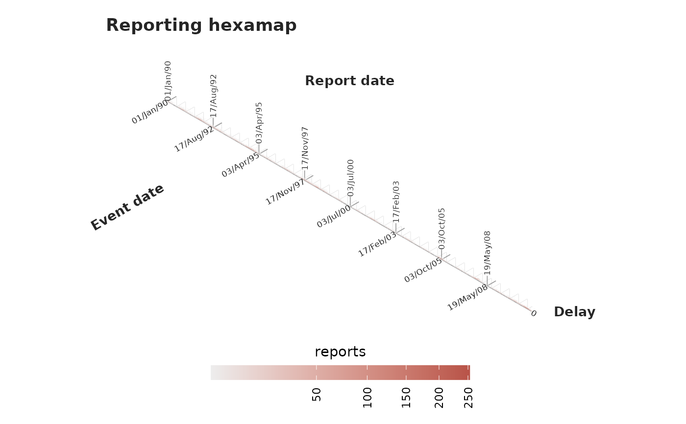
Draws the reporting triangle as a hexagonal age-period-cohort map, using the
projection of Jalal and Burke (2020). Event date, report date and reporting
delay are the cohort, period and age of the map (report = event + delay), and
each (event, delay) cell is one point on the hexagonal lattice, coloured by
its report count. Because
a batch is a single report date, it appears as a clean vertical stripe;
the fast-reporting bulk sits along the short-delay bottom edge.
Usage
plot_reporting_hexamap(
  x,
  max_delay = NULL,
  complete = FALSE,
  iso = NULL,
  iso_minor = NULL,
  format = "%d/%b/%y",
  max_cells = 12000L,
  trans = "sqrt",
  axis = c("report", "revision"),
  size = 1.5,
  shape = 16,
  text_size = 2.3,
  grid_linewidth_major = 0.3,
  grid_linewidth_minor = 0.15,
  axis_linewidth = 0.4,
  legend_width = 7,
  legend_height = 0.4,
  palette = .tbl_now_palette()
)
Arguments
- x
A
tbl_now()object.- max_delay
Largest delay (in report units) to draw.
NULL(default) shows the observed range, auto-capped to respectmax_cells.- complete
If
TRUE, fill the whole observable triangle with zeros so a point is drawn for every observable cell. DefaultFALSE(observed cells only). Coerces linelist input to counts viato_count().- iso, iso_minor
Major and minor grid spacings (in arrival-axis units: report units on the report axis, revision units on the revision axis).
NULLpicks sensible defaults from the data.- format
Date format for the event/report tick labels (see
strftime()). Default"%d/%b/%y".- max_cells
Safety cap on the number of points. Default
12000.- trans
Fill transform for the count scale. Default
"sqrt".- axis
Which time axis to draw:
"report"(default) or"revision". On the revision axis the picture answers the laboratory's version of the question – when results arrived, rather than when reports did. Needs a revision process (seeadd_revision_date()); cases still"pending"have no revision date and are left out.- size
Size of the plotted points, in millimetres, as ggplot2 measures it. Default
1.5. See Details for why there is no data-dependent default.- shape
Point shape, passed to
ggplot2::geom_point(). Default16(a solid circle);15gives squares, which tile the lattice more closely. The count is mapped tocolour, so use a solid shape (0-20) – the fillable shapes21-25would draw the count on the border only.- text_size
Size of the event-, report- and delay-axis tick labels. Default
2.3. The axis titles scale with it.- grid_linewidth_major, grid_linewidth_minor
Line widths of the major and minor triangular grids this function draws (
isoandiso_minorspacing). These are the package's own grids, not ggplot2's – the panel grid is switched off here. Defaults0.3and0.15.- axis_linewidth
Line width of the delay-axis spine and its ticks. Default
0.4.- legend_width, legend_height
Size of the count colourbar, as unit objects or as numbers in centimetres. Defaults
7and0.4cm.- palette
A named colour palette (see
tbl_now_palette()).
Details
The three axes are read off three families of iso-lines: report date (period) runs vertically, delay (age) up the right-hand spine, and event date (cohort) up the left. A major/minor triangular grid is drawn so any point can be traced back to its event date, report date and delay.
The number of points is #\{observed (event, delay) cells\}, which grows with
the delay range. To stay responsive the delay axis is capped so at most
max_cells points are drawn (raise max_cells, or set max_delay, to change
this). complete = TRUE first fills the whole observable triangle with explicit
zeros (via complete_zeroes()) so the empty cells are shown too.
A point is sized in millimetres and the lattice is sized in data units, so no
default size can be right for every combination of cell count and figure
size – which is exactly why size exists. Raise it until the points nearly
touch for the figure you are actually drawing.
References
Jalal, H. and Burke, D. S. (2020). Hexamaps for Age-Period-Cohort Data Visualization. Epidemiology 31, e47-e49.
See also
plot_reporting_triangle() for the same data on ordinary axes, where the
third quantity has to be read off the diagonals; diagnostic_plot() for the
whole gallery.