![[Stable]](figures/lifecycle-stable.svg)
The same cases, counted on two different clocks. Comparing the two is the single most useful thing you can do to tell a real outbreak from a reporting artifact.
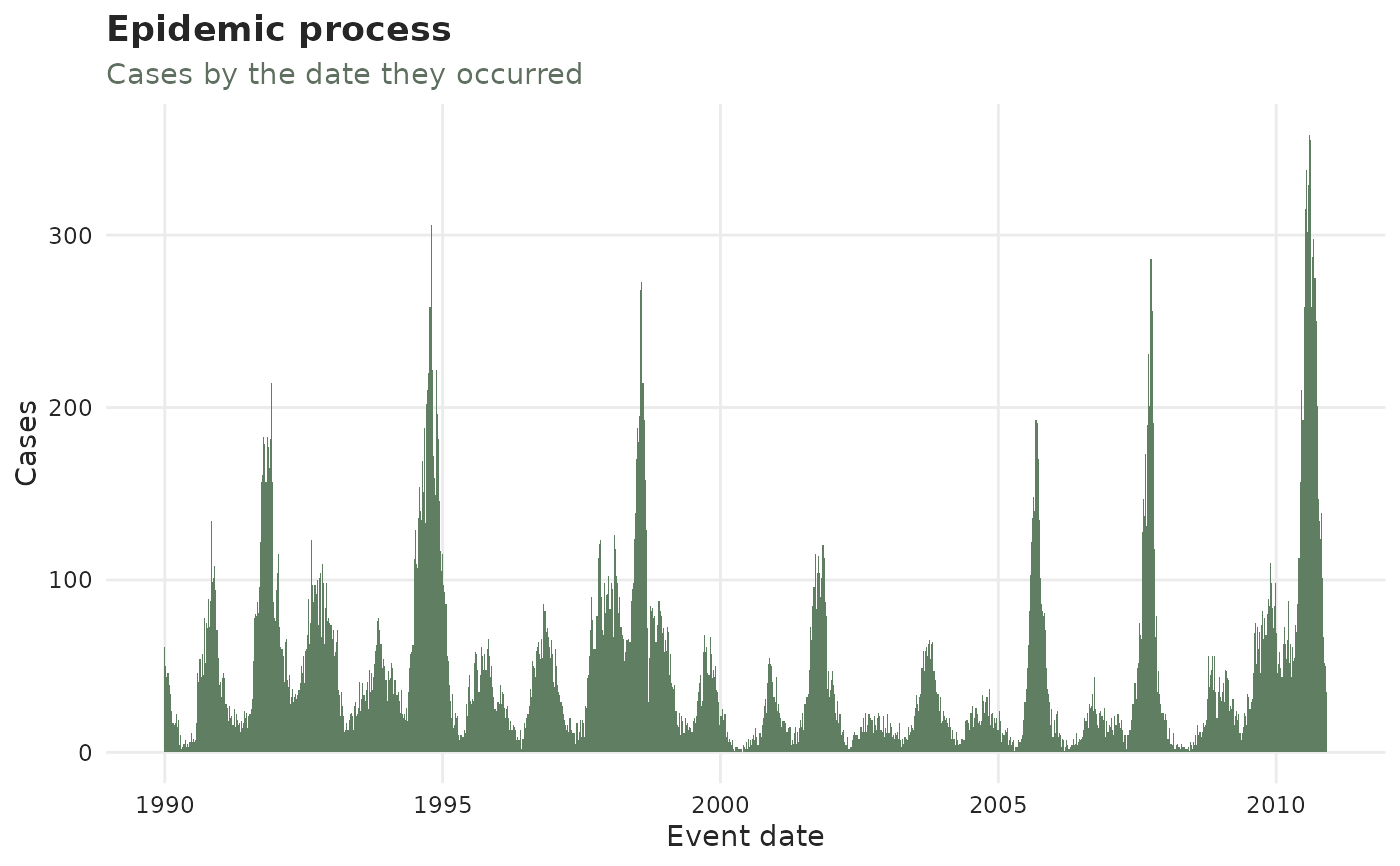
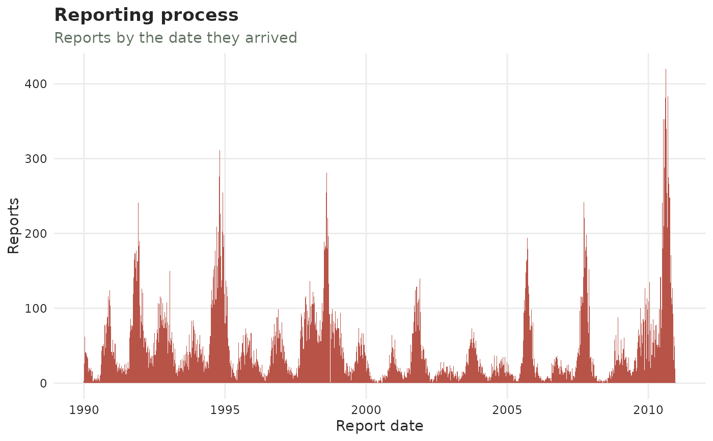
plot_epidemic_process()counts by event date – when the cases actually happened. Epidemics grow and shrink smoothly, so this curve should be smooth.plot_reporting_process()counts by report date – when news of them arrived. Reporting is administrative, so this curve is spiky: weekends, holidays and backlog releases all show up here.
A lone spike in the reporting process with nothing under it in the epidemic process is a batch – a day the system cleared its inbox, not a day people got sick. A spike in both is a genuine surge.
Arguments
- x
A
tbl_now()object.- plotly
If
TRUE, return an interactive plotly widget (hover, zoom) instead of a static ggplot2 plot. DefaultFALSE.- axis
Which time axis to draw:
"report"(default) or"revision". On the revision axis the picture answers the laboratory's version of the question – when results arrived, rather than when reports did. Needs a revision process (see add_revision_date()); cases still"pending"have no revision date and are left out.- by_revision_type
Logical (default
TRUE),plot_reporting_process()only. Stack each bar by how the arrivals it counts eventually resolved –confirmed,pending,retractedandunknown, in the palette's outcome colours (seetbl_now_palette()) – so a day whose reports were mostly taken back is visible as such rather than as an ordinary day. Ignored on an object with no revision axis. It cannot be taken fromcount-cumulativedata, which records running totals rather than cases, and warns and draws the unsplit bars there.- palette
A named colour palette (see
tbl_now_palette()). These two panels draw bars and nothing else, so they take nosizeorlinewidth.
See also
diagnostic_plot(), which draws these alongside the rest of the
reporting-process gallery; plot_observed_cases() for the epidemic process
with the incompleteness cutoff marked; diagnose_batches() to test a
suspicious spike rather than eyeball it.