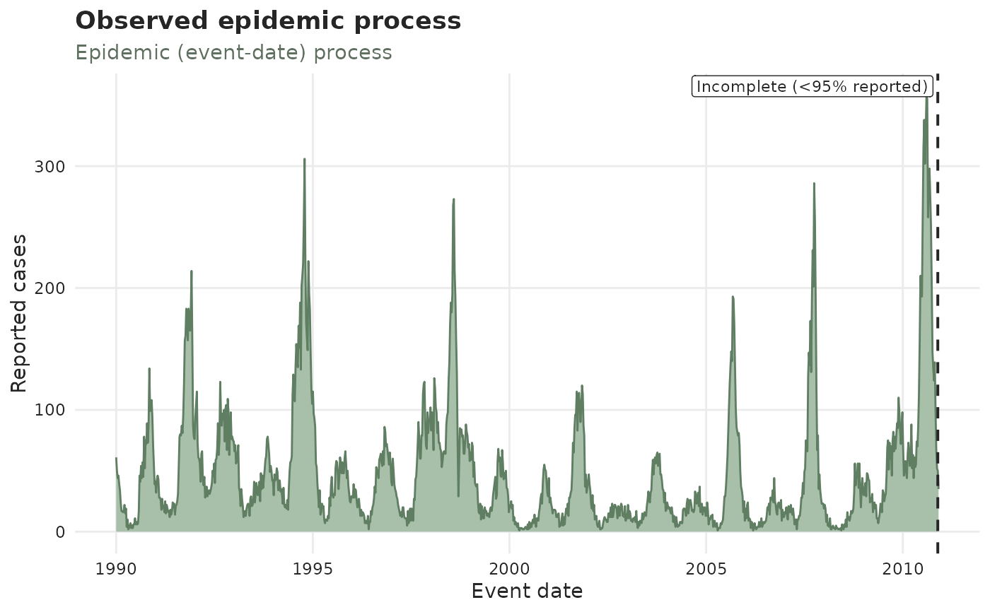
Observed epidemic process with the incompleteness line
Source:R/plot_effects.R
plot_observed_cases.Rd![[Stable]](figures/lifecycle-stable.svg)
The "epidemic" panel of autoplot(), drawn on its own: the latest reported
counts per event_date, with a dashed vertical line marking where the data
become incomplete (less than level of the delay distribution has arrived).
Holidays from an attached temporal_effects() spec are marked with red dots.
plot_epidemic_process() draws the same curve without the incompleteness
line, next to its reporting twin plot_reporting_process().
Arguments
- x
A
tbl_now()object.- ...
Further arguments passed to
autoplot.tbl_now(), e.g.level,by_strata,strata,event_date_xlim,plotlyorpalette.