![[Stable]](figures/lifecycle-stable.svg)
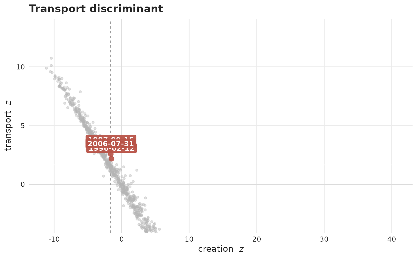
Places each report date by its creation score (x) and transport / deficit
score (y) from transport_discriminant(), shading the region that decides the
batch call. Surges are not distinguished here (they fold into the quiet
background) since only the batch call is of interest.
Usage
plot_transport_discriminant(
  x,
  ...,
  plotly = FALSE,
  size = 1,
  grid_linewidth = 0.3,
  palette = .tbl_now_palette()
)
Arguments
- x
A
tbl_now()object.- ...
Passed to
transport_discriminant()(e.g.lookback,period,alpha).- plotly
If
TRUE, return an interactive plotly widget instead of a static plot. DefaultFALSE.- size
Multiplier on the size of the points and their date labels. Default
1: unflagged points are drawn at1.1, confirmed batches at2.6. It is a multiplier rather than an absolute size precisely so that enlarging the marks keeps the flagged ones bigger than the rest.- grid_linewidth
Line width of the zero lines and the dashed significance thresholds this function draws – the package's own reference grid, not ggplot2's. Default
0.3.- palette
A named colour palette (see
tbl_now_palette()).
Details
Only the diagnose_batches()-confirmed batches (Benjamini-Hochberg-corrected) are
coloured red; the dashed lines and shaded region are a reference for where a
batch sits (deficit cleared, and significant), not the flagging rule. The most
extreme-looking points (far left, far up) are holds – windows still depleted
because the release has not happened yet – not batches. A genuine batch sits in
the band just to the right of the vertical line, once the window total recovers.
See also
transport_discriminant() for the numbers behind the plane;
diagnose_batches() for the hypothesis test that flags the red points;
plot_reporting_process() for the series they come
from; diagnostic_plot() for the whole gallery.
Examples
data(denguedat)
# The two and a half years around the 1996 and 1997 backlog dumps, so that
# the plane has red points on it without scanning the whole series.
window <- denguedat[
  denguedat$onset_week >= as.Date("1995-06-01") &
    denguedat$onset_week <= as.Date("1998-01-01"),
]
dn <- tbl_now(window, onset_week, report_week, verbose = FALSE)
plot_transport_discriminant(dn)