![[Experimental]](figures/lifecycle-experimental.svg)
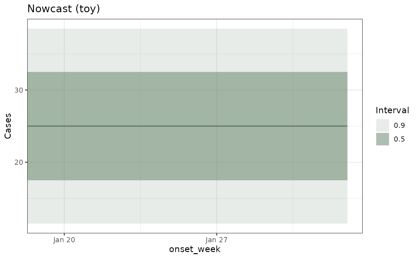
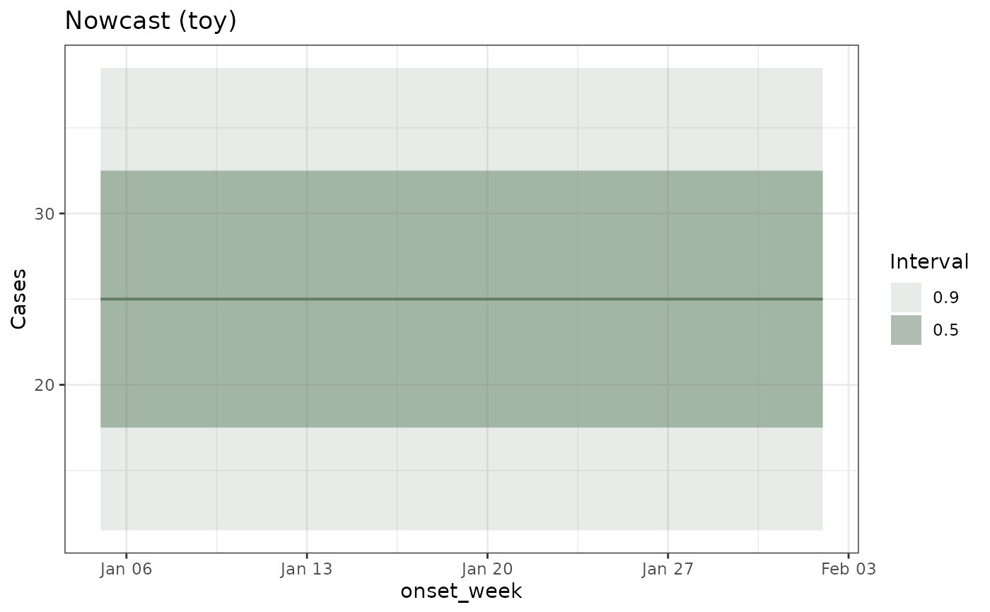
Draws a fan chart of a tbl_nowcast: the counts reported so far as grey columns, one shaded band per central prediction interval over them, and the median as a line, so that the size of the correction the model is applying is visible as the gap between the bars and the fan.
Usage
# S3 method for class 'tbl_nowcast'
autoplot(object, ..., levels = NULL,
  show_reported = TRUE, colour = NULL, linewidth = 1, date_lim = NULL,
  ylim = NULL, palette = .tbl_now_palette())
Arguments
- object
A tbl_nowcast object.
- ...
Unused; present for compatibility with
ggplot2::autoplot().- levels
Numeric vector of central interval widths to shade. Defaults to the widest intervals available in the object.
- show_reported
Logical. Whether to draw the cases reported so far as columns under the fan –
get_latest_reported_cases()on the object's own source data, so the bars are what the model was actually shown as ofnow, not what those dates eventually reached. The vertical gap between the top of a bar and the fan is the correction the nowcast is making, which is the whole reason to draw it. Requires the nowcast to carry its source data.The bars are one period wide, taken from
get_event_units(). A fixed width would draw hairlines on a weekly series, and one wider than the step would make ggplot2 stack overlapping bars, so each would show several periods' counts rather than its own.- colour
Colour of the fan. Defaults to the
tbl.nowpalette's green: a nowcast is an estimate of the epidemic process (cases by event date), which the package always draws in green, with red reserved for the reporting process.- linewidth
Multiplier on the width of the median line. Default
1; it multiplies rather than replaces the geom's own width.- date_lim
Length-2 vector of event-axis limits, as
Dates (or as numbers on a numeric event axis).NAin either position leaves that end alone. A nowcast covers the whole series but only corrects its final periods, so the interesting part is usually the last few weeks; this zooms on to them.The limits are applied with
ggplot2::coord_cartesian(), so they crop the drawn plot rather than filter the data. That matters here: a scale limit would drop the out-of-range rows before the ribbon is built, which cuts the fan off at the boundary instead of letting it run to the edge.- ylim
Length-2 vector of count-axis limits, applied the same way.
NULL(default) leaves the axis to ggplot2. Note that a stratified nowcast facets withscales = "free_y", so one pair of limits is imposed on every panel.- palette
A named colour palette (see
tbl_now_palette()). Each colour is named for the role it plays, so overriding one role re-themes the plot.
Details
A named function registered in .onLoad(), like the neighbouring tidy()
and as_tibble() methods and for the same two reasons.
S7::method(autoplot, tbl_nowcast) <- would be shorter, but method<- is a
replacement function, so R rewrites the call as an assignment back to
autoplot and leaves a copy of ggplot2's generic in this
namespace. That copy is what R CMD check sees when it decides autoplot
is a generic this package owns and exports, which in turn makes every
autoplot.* function here look like an S3 method that was never registered.
Plain registration copies nothing.
The function is also named for the method it implements, rather than being
assigned anonymously into the generic, so that R CMD check can resolve this
topic's usage section back to an object that exists.
Examples
predictions <- tidyr::expand_grid(
onset_week = as.Date("2020-01-05") + seq(0, 28, by = 7),
.quantile_level = c(0.05, 0.25, 0.5, 0.75, 0.95)
)
predictions$.value <- 10 + 30 * predictions$.quantile_level
nc <- tbl_nowcast(predictions = predictions, method = "toy", event_date = "onset_week")
autoplot(nc)
 # Zoom on to the corrected weeks without dropping the rows that build the fan.
autoplot(nc, date_lim = c(as.Date("2020-01-19"), as.Date("2020-02-02")))
# Zoom on to the corrected weeks without dropping the rows that build the fan.
autoplot(nc, date_lim = c(as.Date("2020-01-19"), as.Date("2020-02-02")))